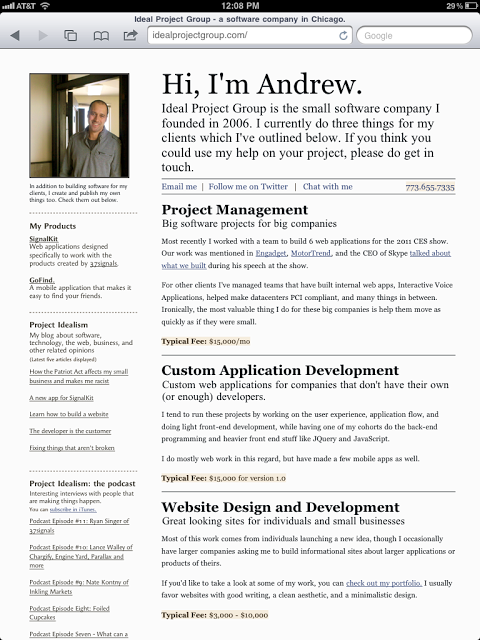
I've been wanting to redesign the Ideal Project Group website for a while, but between client work and SignalKit, I hadn't made it a priority. I finally got to the redesign this week, and I'm really happy with how it turned out. Here's a screenshot:
There were a few key things I wanted to address with the site, and also some areas where I wanted to practice.
Reflecting where my business is right now
First, I needed to make the site a more honest representation of who I am, what Ideal Project Group is, and how it and I relate. In other words, I am Ideal Project Group, and Ideal Project Group is me, and it was time for my website to reflect this reality.
I wrote a month or two ago about the lesson Maile taught me about accepting where you are, and I really wanted to make a site that didn't portray where I hoped to be in a few years - but showed where I was at right now. I think I got it right this time.
Easy to update portfolio
The other thing I needed to do was have an easy way to update my portfolio. I was really slacking on keeping my site up to date with my latest client work, and I needed to fix that. The site is entirely hand written by me, but I plugged in Perch - the really little content management system I learned about from Ryan Singer. They have an awesome (no, seriously, it's amazing) portfolio app that allows you to add an image gallery, light boxes, and some other goodies.
Now, when I want to update my portfolio, I simply go to the Perch admin section, write a paragraph, upload a photo, and I'm done.
Attention to Typography
Something I've been practicing with more lately is typography, and choosing fonts that work well together and portray the right message. I've been using TypeKit lately, and I love it. I used Georgia and Garamond throughout the site, and in the left sidebar where I call out the things I create, I used the Angie STD sans-serif font.
I'll probably keep playing with the sidebar font, but overall I'm very happy with how things turned out.
Quickly showing products and publications
One thing I liked about my blog that I wanted my site to replicate was showing all my info on one page. Now, right on the landing page, I outline what I do, who I do it for, what my products are, and what my latest blog posts and podcasts were.
It's a challenge to show this much information without it being overwhelming, but I think I've managed to list it all without the site looking too busy.
Pricing
The last thing I wanted to do was make my pricing clear and easy to understand. Instead of listing out products, services, and pricing though, I took a slightly different approach. Where I describe my services, I outline my typical fees under the description. Then, in the portfolio section, I say what a similar website build would cost.
This allows new visitors to get a decent understanding of my pricing model, and to see if I'm right for their budget.
Let's see what happens
Of course, I don't know how this new site will perform yet. But, I think it's a unique site with a bit of personality, that definitely stands out - especially when compared to many of the other sites that show up in the same search queries as mine.
I'm definitely open to feedback and curious to hear peoples thoughts, so if you have any you'd like to share - I'd love to hear what you have to say.